Perform Pro
Rethinking Sales-driven Performance UX
Rethinking Sales-driven Performance UX
Perform Pro enables companies to track key performance indicators (KPIs) and metrics that are important to their business and provide insights into how they can improve their operations and achieve their goals.
Perform Pro enables companies to track key performance indicators (KPIs) and metrics that are important to their business and provide insights into how they can improve their operations and achieve their goals.
Client
Bajaj
Tapplent
Entomo
Services
UX Research
UX & UI Design
Prototyping
Industries
SaaS
Date
Sep 2022
Scan Time
5 Mins
The journey to design this application is rooted in addressing the challenge of Business Managers struggling to assess employee performances and enhance KPIs, while employees grappled with tracking their KPIs and associated incentives, often seeking external guidance.
The solution envisioned was a comprehensive platform enabling performance tracking at both macro and micro levels, coupled with advanced features for a personalized experience that fosters performance improvement for managers and employees.
With a vague schema in mind & a bunch of notebook sketches, we started outlining the Design Process & how we could fit all the necessary steps into the tight timeframe that we had.
With a vague schema in mind & a bunch of notebook sketches, we started outlining the Design Process & how we could fit all the necessary steps into the tight timeframe that we had.
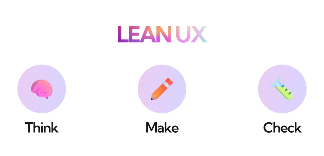
Due to the time constraints, we had to select a design approach that was fast yet effective. Hence adopting an Agile cycle that quickly synthesized our thoughts into visual prototypes that we could test and gather feedback on, appeared to be the most suitable.
This Lean UX approach allowed us the ability to figure out solutions at a rapid rate, continuously building on the existing idea with iterations, from structure to surface.
After a series of discussions and insights that I had drawn from our quick secondary research, we decided to make a dashboard-based platform that would focus on data visualization with a user-centered approach.
The key element of the interface would be digestible data snippets that would assist the user in comprehending their own performance with absolute ease. We also decided to add functionalities in terms of accessing contacts & resources with the prime objective of improving performance figures.
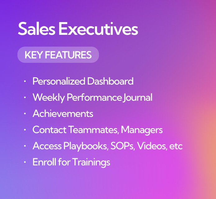
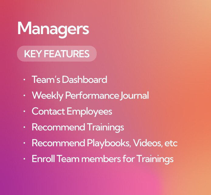
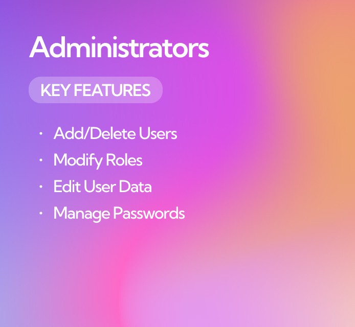
To begin with, we outlined 3 key roles with different capabilities, interfaces, and user experiences. These roles were defined to suit three types of users:
To begin with, we outlined 3 key roles with different capabilities, interfaces, and user experiences. These roles were defined to suit three types of users:
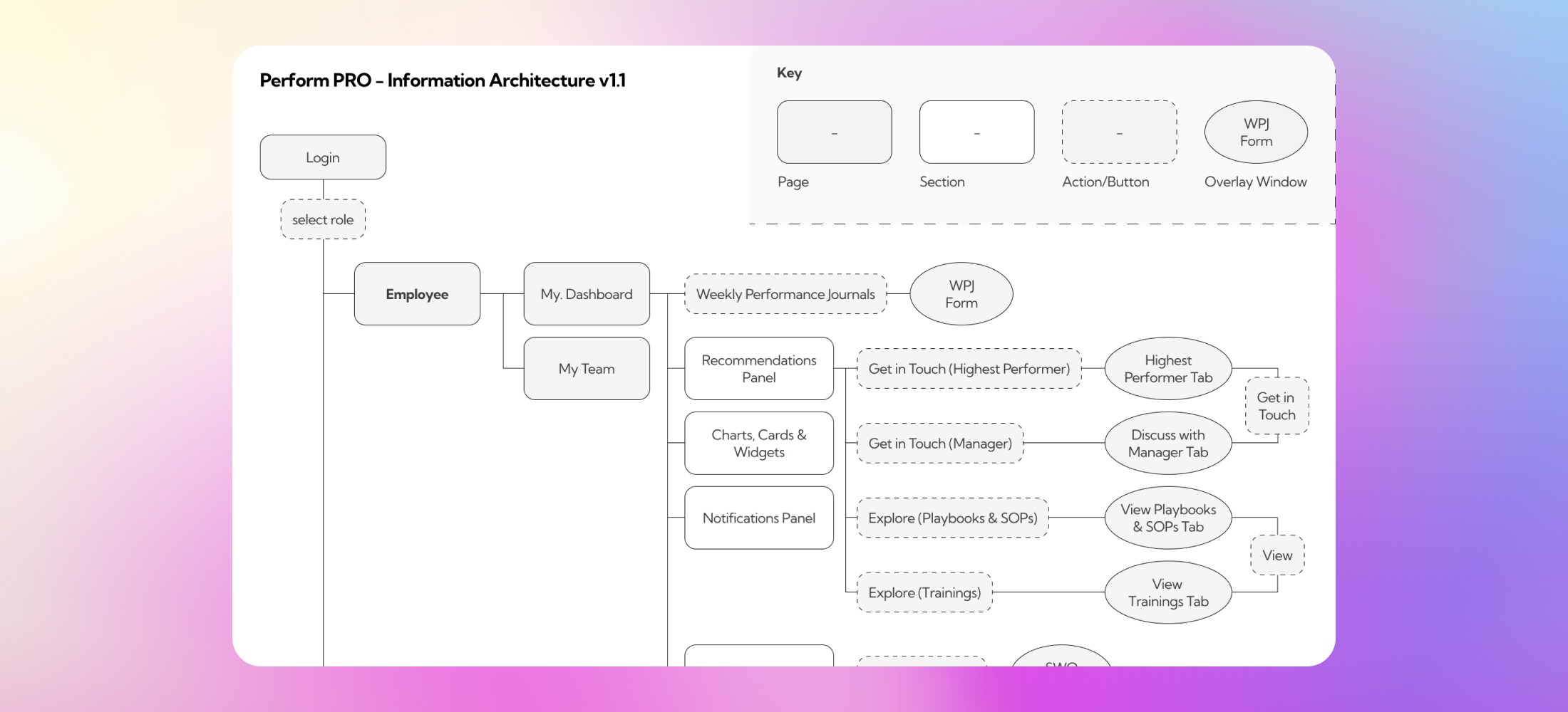
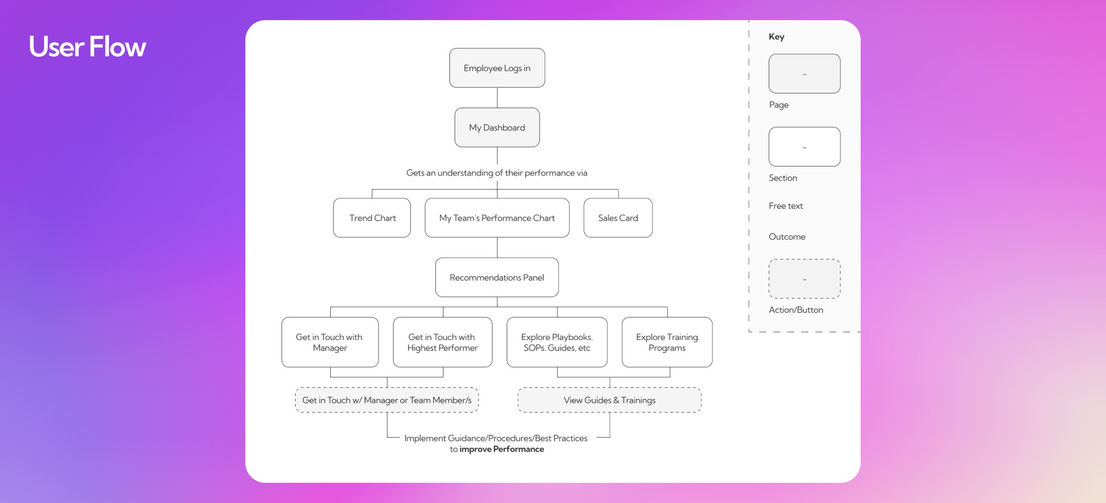
After defining roles, the next step was to define a more elaborate structure for the platform.
After defining roles, the next step was to define a more elaborate structure for the platform.
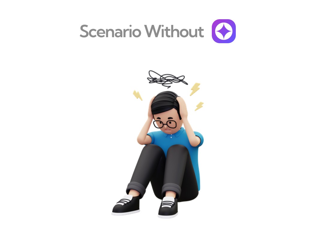
Scenario without Perform PRO - Andrew, a sales executive has to go through a pile of spreadsheets and emails scattered across his work laptop's folders to understand what he's done in the current month and to also get an understanding of how well he did, was it better than last month, if yes, then how better?
And since Andrew works on a commission-based model, he also has to keep track of his incentives which are correlated with his sales numbers. Everything's a colossal mess at the moment which consumes Andrew's time and energy and directly affects his sales, clientele & incentives.
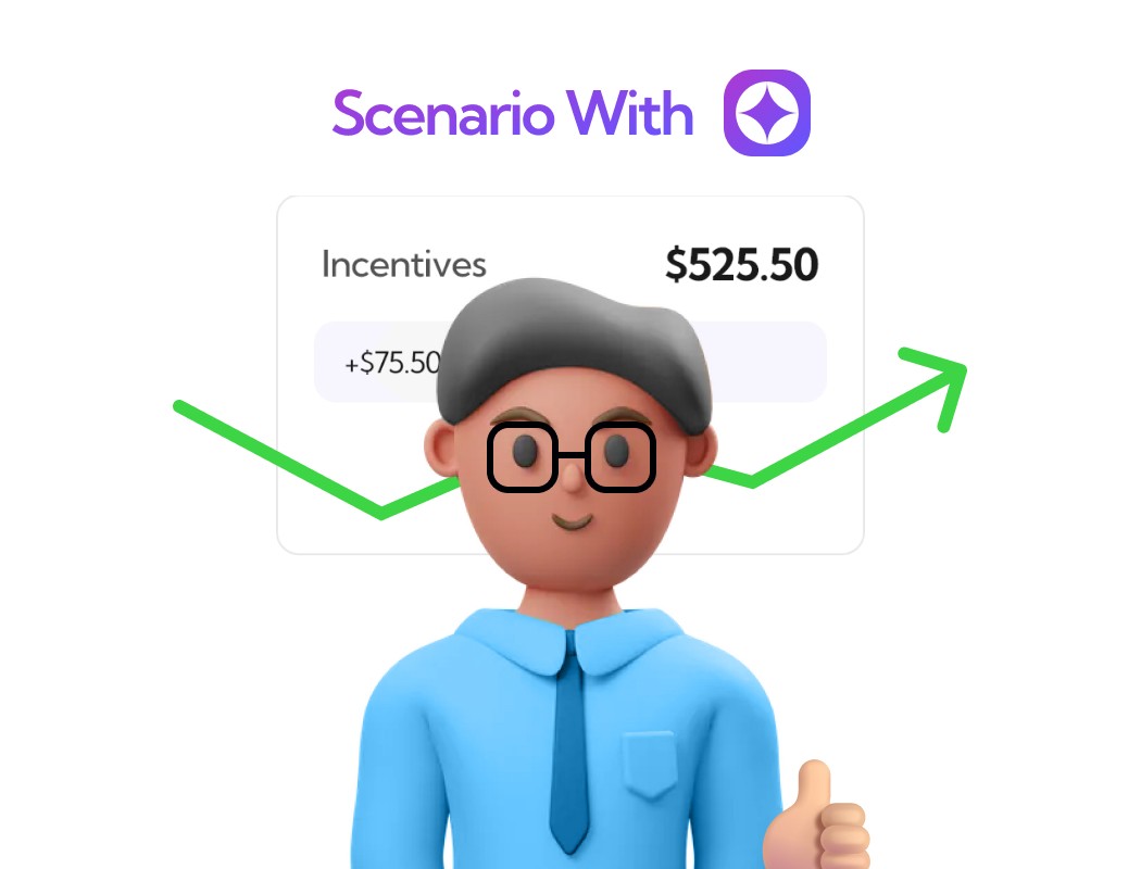
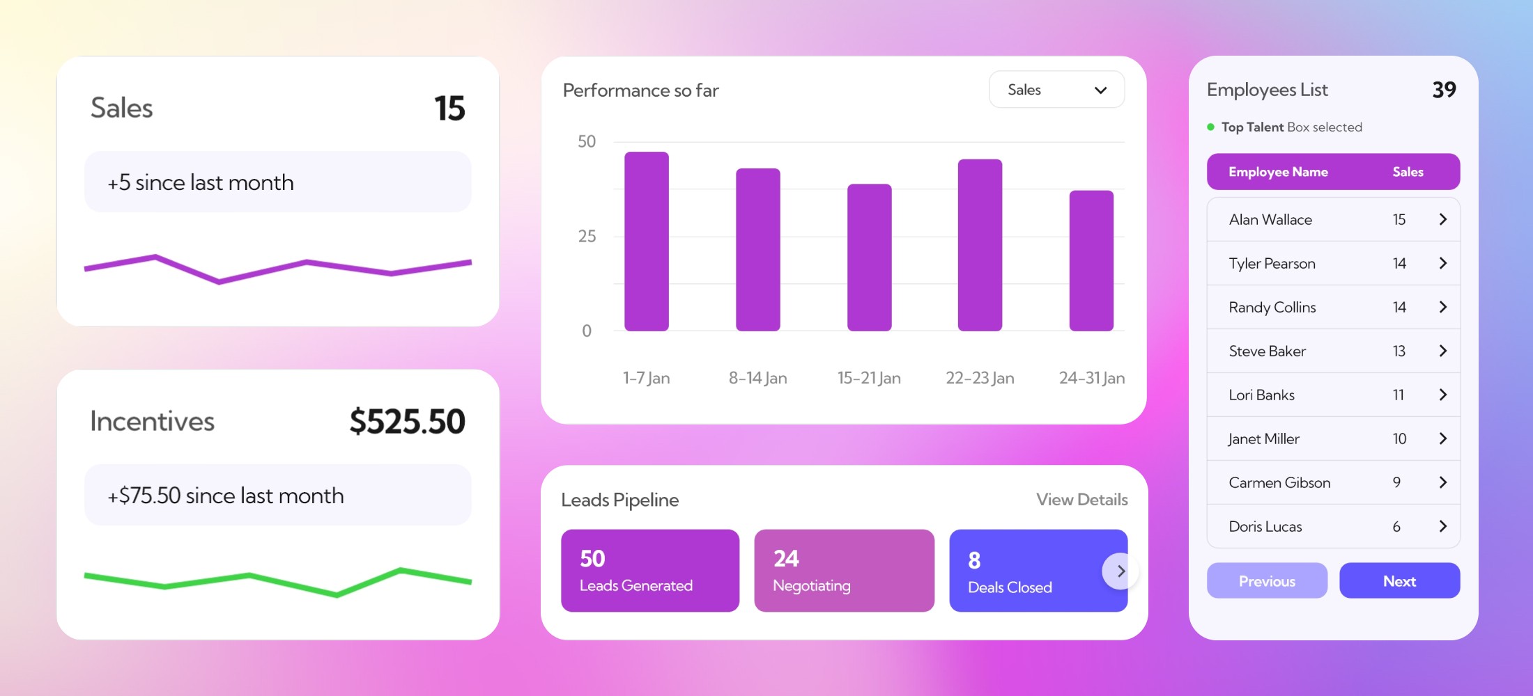
Scenario with Perform PRO - Andrew logs into Perform PRO where his real-time data is being visualized in a way that is easy to understand and analyze. Even if data comes in the form of a spreadsheet or document, it can be directly loaded on the platform and uploaded.
Now if Andrew's manager asks for a report, Andrew can quickly export his charts for a selected time period and share it with the manager. This leaves Andrew with ample time & energy that he can invest in improving his sales figures, building better relationships with his clientele, and receiving better incentives.
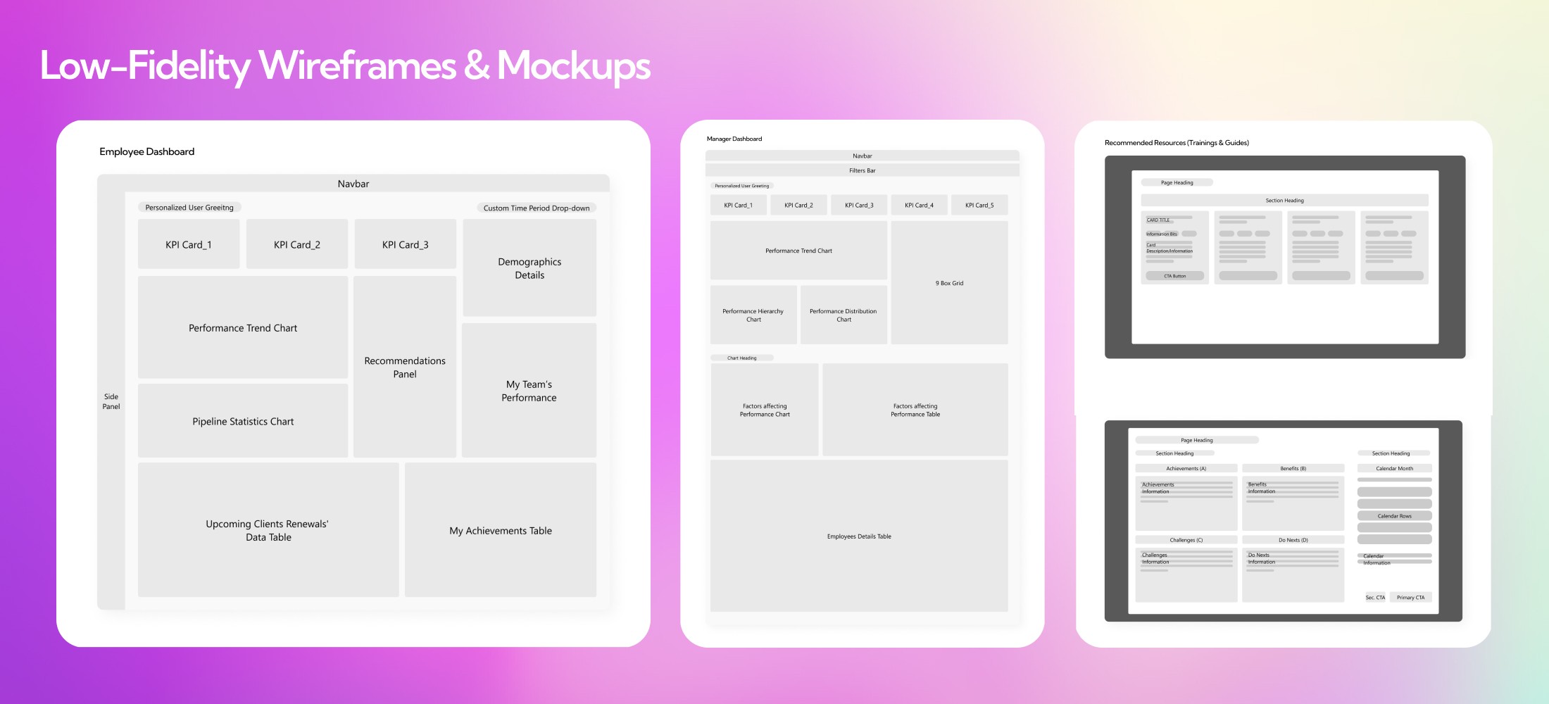
I quickly sketched out some low fidelity wireframes and screen layout mockups to visualise the structure of individual pages.
I quickly sketched out some low fidelity wireframes and screen layout mockups to visualise the structure of individual pages.
We wanted a color scheme that felt modern & professional. The colors also had to fulfill the company’s brand identity. After all consideration, we decided to use the colors depicted below along with Red & Green as performance indicators.
We wanted a color scheme that felt modern & professional. The colors also had to fulfill the company’s brand identity. After all consideration, we decided to use the colors depicted below along with Red & Green as performance indicators.
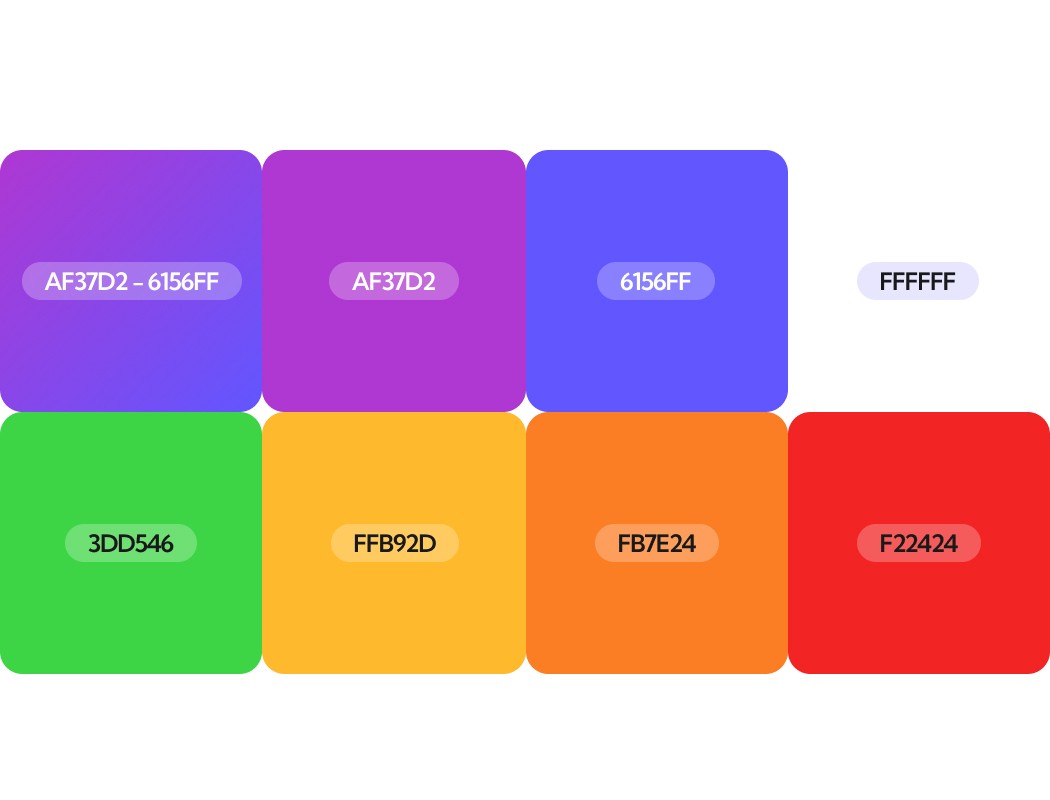

For Typography, we went with Kumbh Sans & its 3 varying weights. According to me, this font gave a modern & easy-to-comprehend visual look and didn't compromise readability even on low font sizes.
For Typography, we went with Kumbh Sans & its 3 varying weights. According to me, this font gave a modern & easy-to-comprehend visual look and didn't compromise readability even on low font sizes.
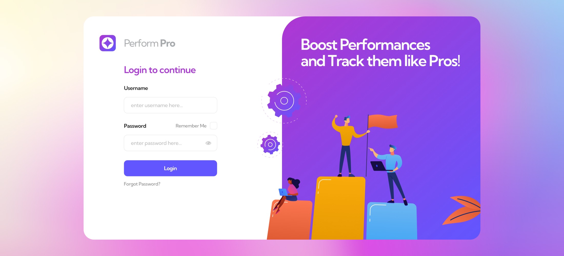
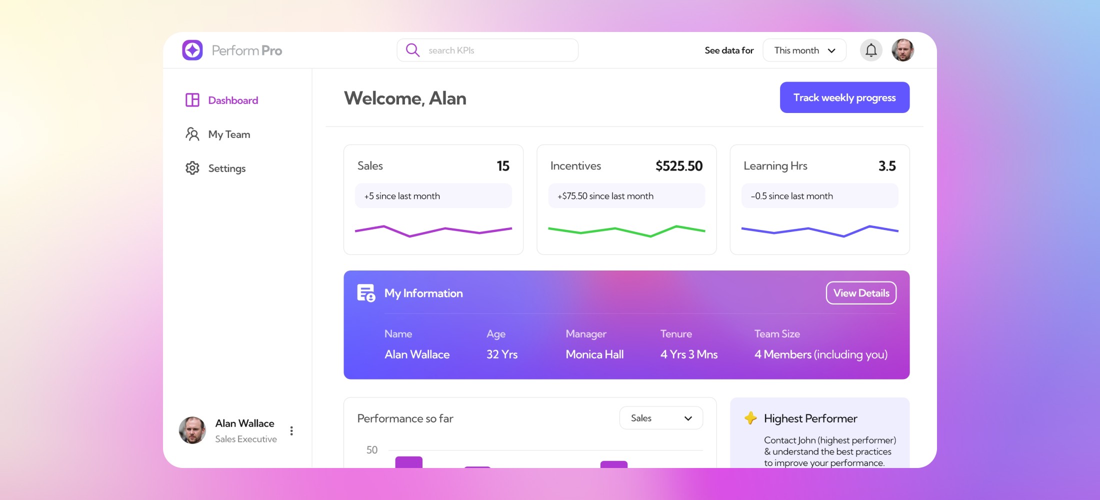
Here are some of the UI snapshots from the final prototype of the platform.
Here are some of the UI snapshots from the final prototype of the platform.
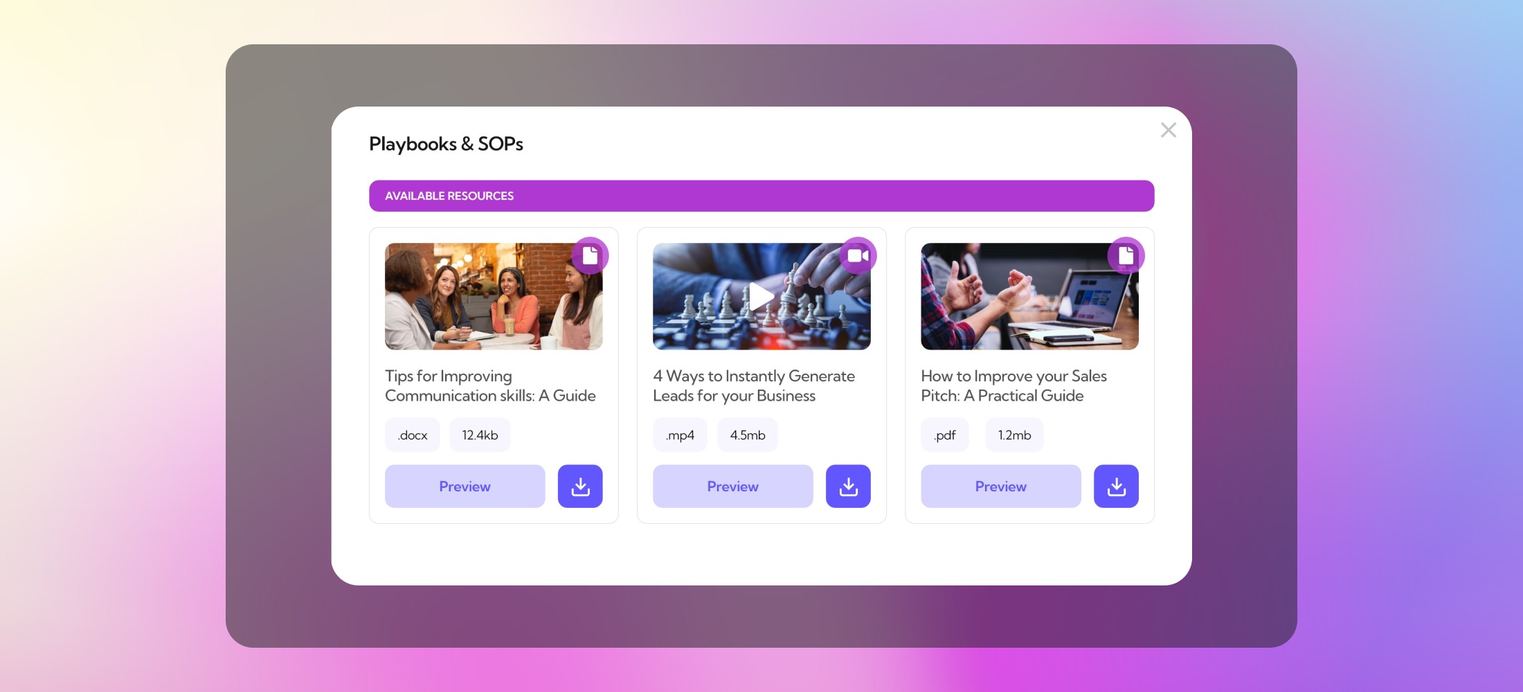
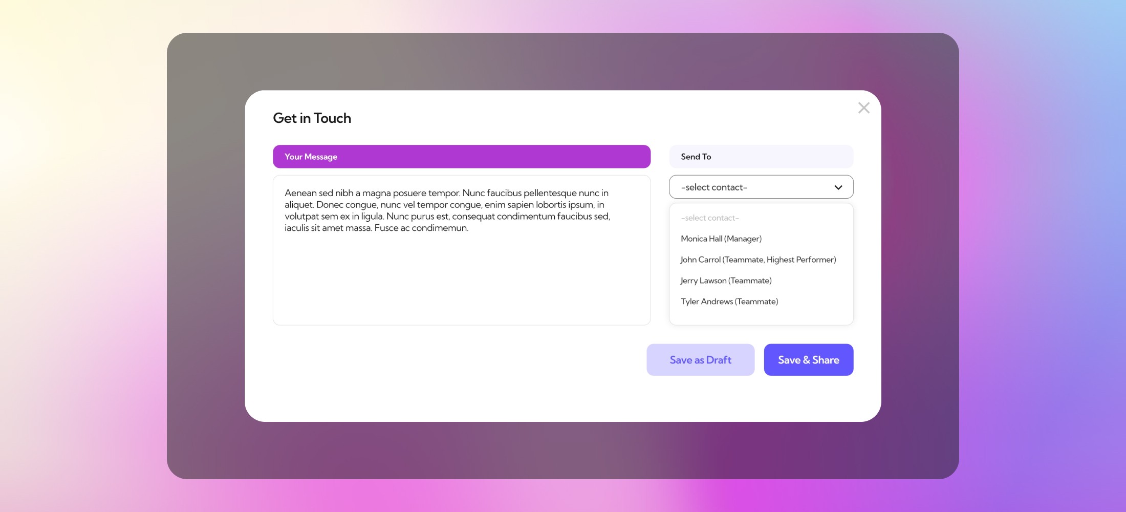
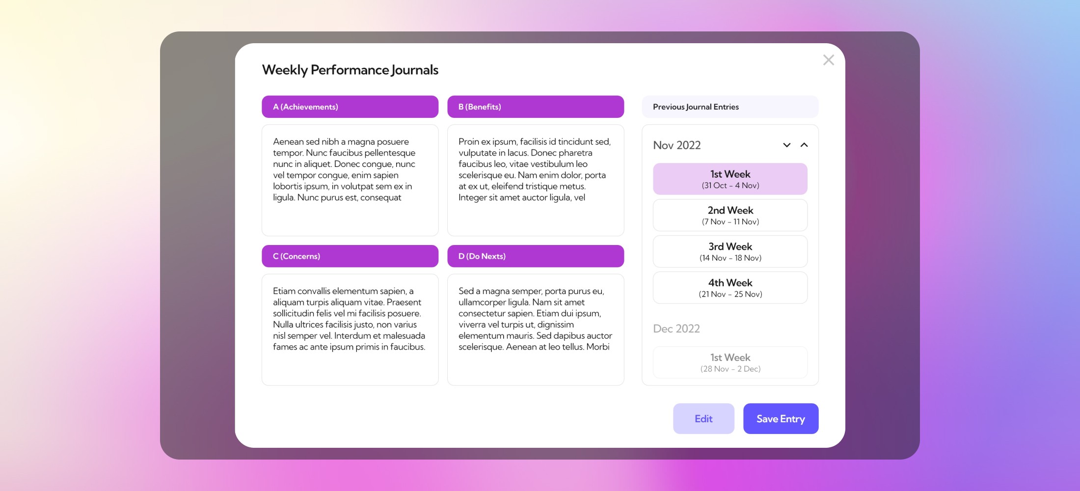
Screens for Weekly Performance Reviews, Contacting Managers & Teammates and Exploring & Downloading Resource material was made available through overlay modal screens.
Screens for Weekly Performance Reviews, Contacting Managers & Teammates and Exploring & Downloading Resource material was made available through overlay modal screens.
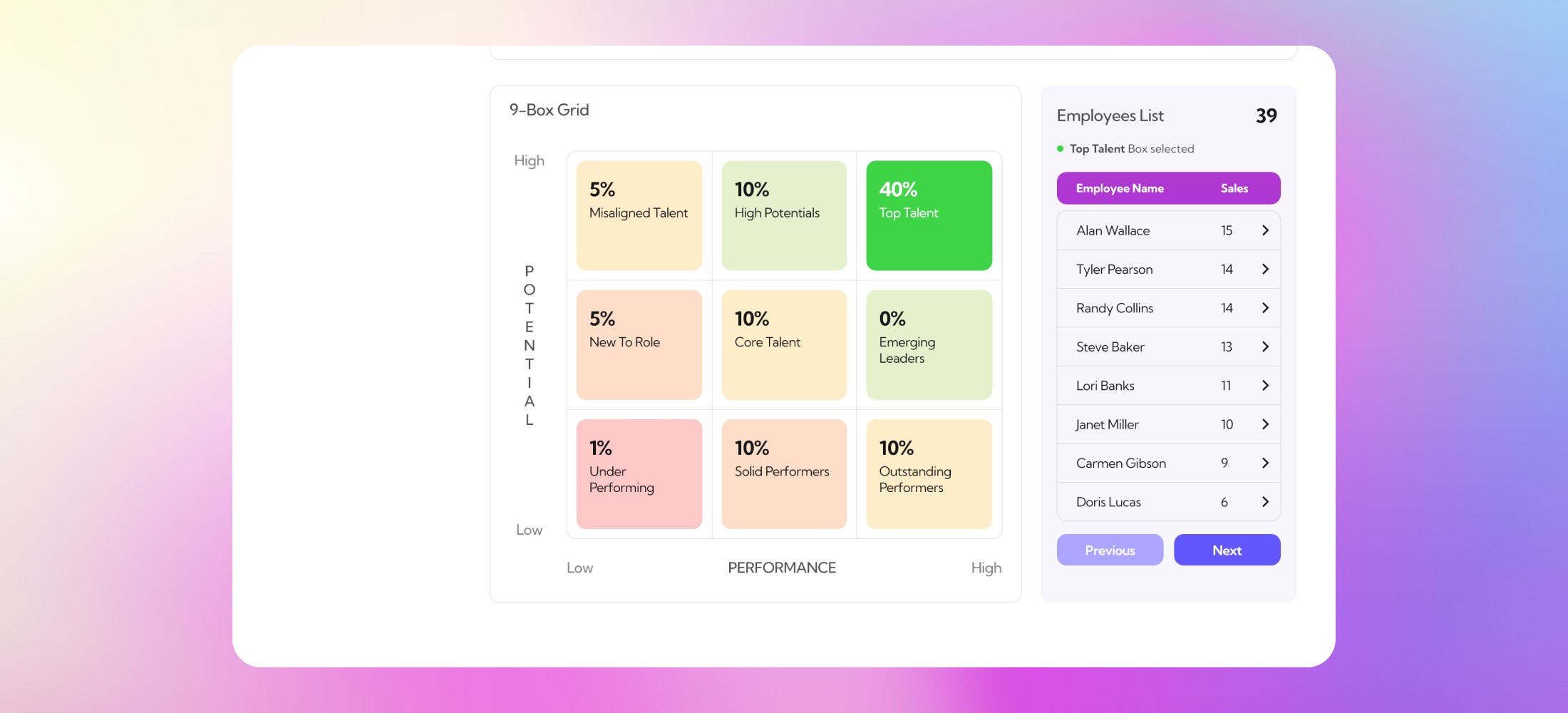
Home Screen for the Manager was a macro-level dashboard screen for all the employees in their team. This included some fascinating charts like 9-Box Grid and Performers Trend to easily interpret team performance.
Home Screen for the Manager was a macro-level dashboard screen for all the employees in their team. This included some fascinating charts like 9-Box Grid and Performers Trend to easily interpret team performance.
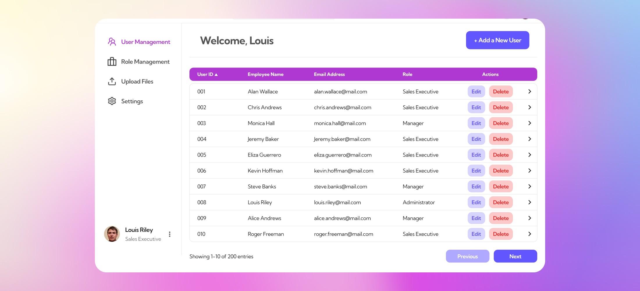
The User Interface for Admins was a simple tabular screen with Users & Roles information which the Admin could easily edit, modify or delete.
The User Interface for Admins was a simple tabular screen with Users & Roles information which the Admin could easily edit, modify or delete.
After designing an interactive, functional prototype within two weeks of the design brief, we started testing it with users who mainly included of business heads and product managers from various organizations.
While the overall response was rather positive, we observed a ‘Lack of depth’ on some features being a common frustration point. Some users also struggled with navigating around the Weekly Performance Journal. We jotted down these two major and a few minor usability flaws which we quickly tried to resolve in the next iteration.
On a positive note, users enjoyed the simplicity & ease with which all their data was organized. It didn’t overwhelm the users at first glance, which is a key challenge when designing with data.